
Bembo Book MT Pro Poster
by Mary Hansen
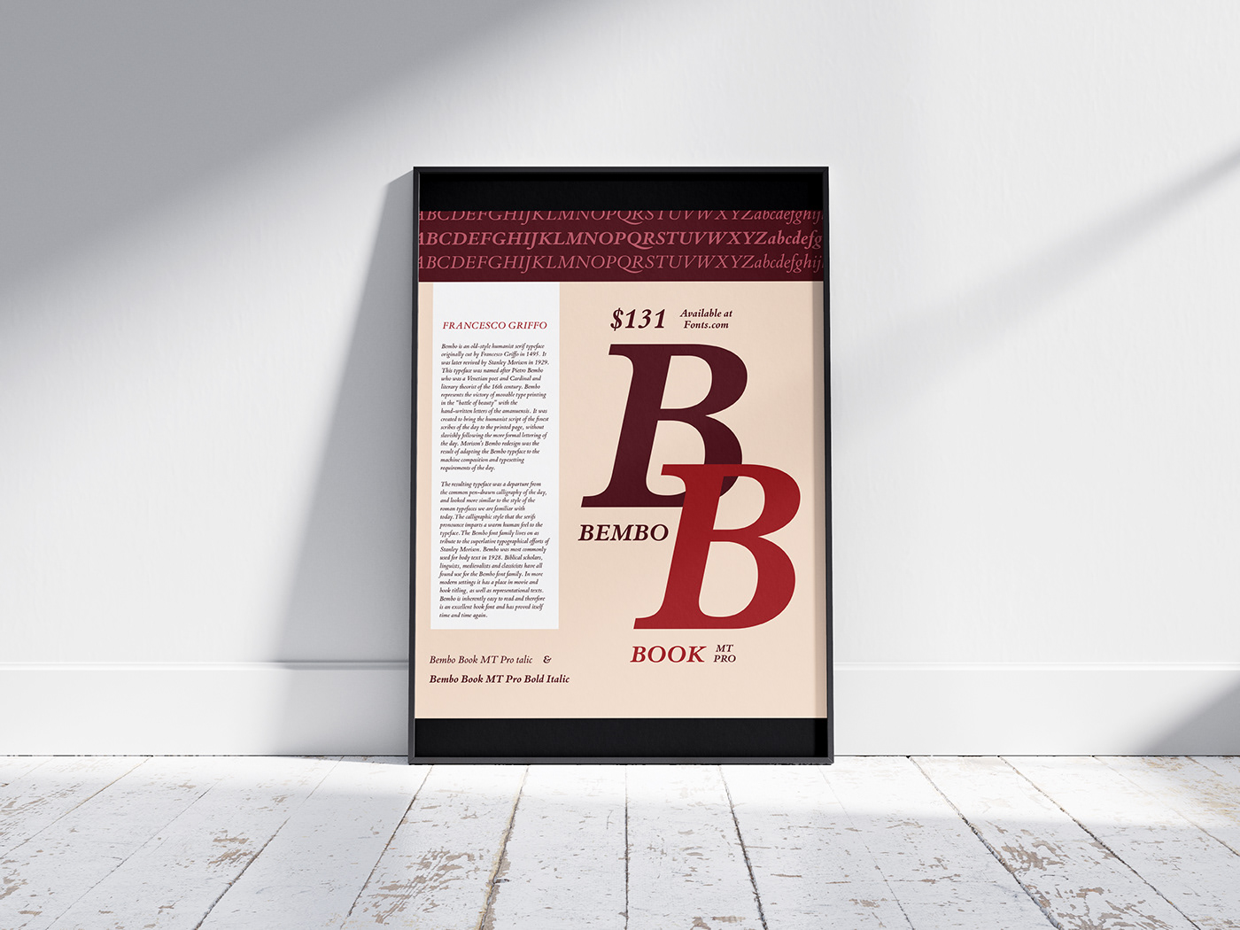
Final typography poster as a mockup
Introduction: The purpose of this project is to create a well designed poster that will promote a font to other graphic designers. It needs to communicate clearly its message in a creative and eye catching way.
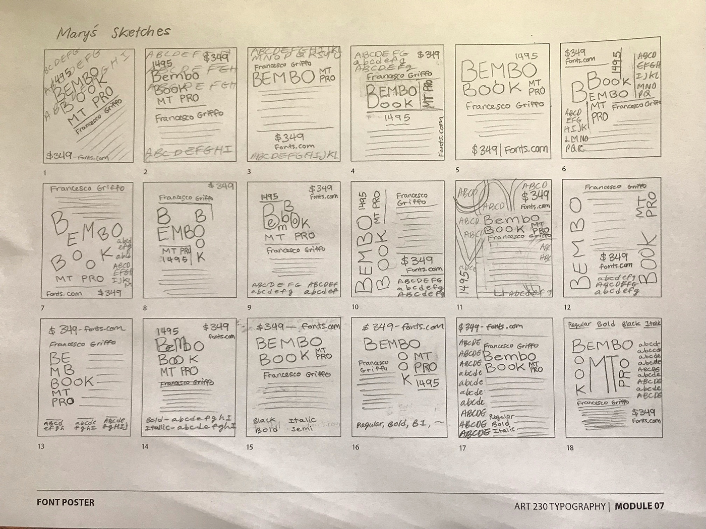
DISCOVER: To start out, I drew some quick sketch ideas:
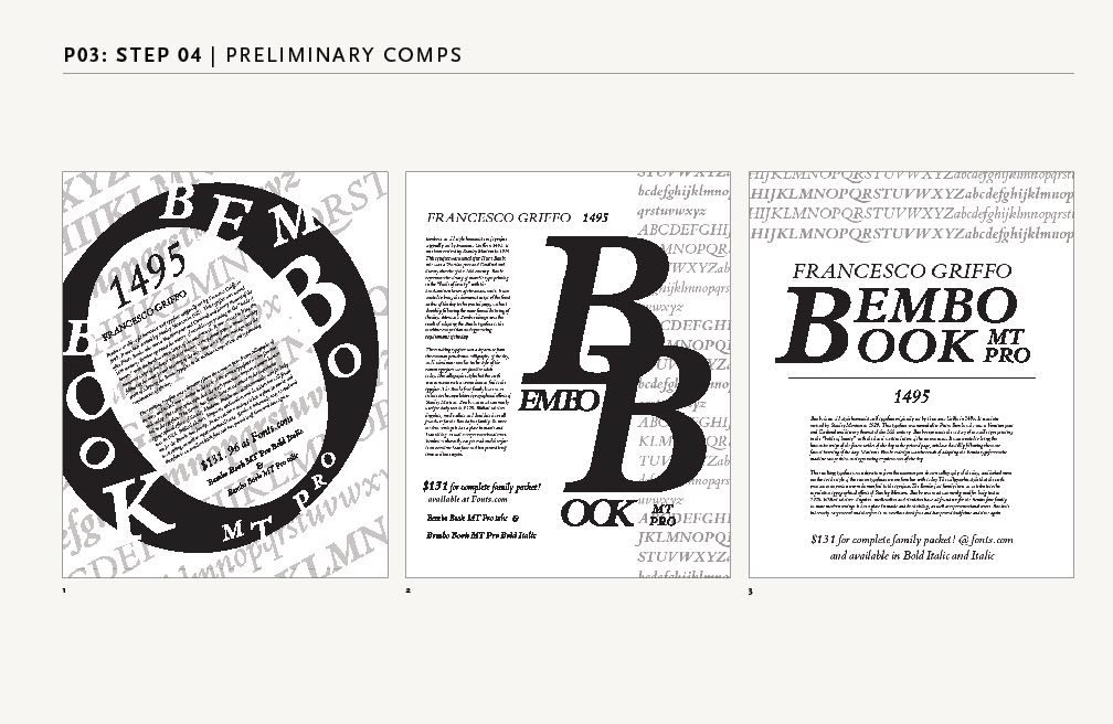
DESIGN: Then, I created some digital sketches in Adobe Illustrator:

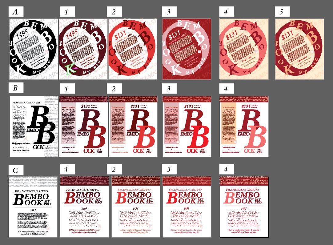
After some class feedback and some more digital experimentation, I came up and narrowed down three poster ideas. After that, I explored different color combinations:
From what I researched, "Bembo represents the victory of movable type printing in the “battle of beauty..." (https://cba-design.com/italy/en/insights/bembo/)
I looked up what color would represent victory and the color red came up. So, I chose the main color theme to be red. (https://www.nytimes.com/2005/05/18/science/the-color-of-victory-is-red-scientists
say.html#:~:text=%22Across%20a%20range%20of%20sports,Thursday%20in%20the%20journal%20Nature.)
DELIVER: Again, after much feedback and refinement, I landed on this final design for my typography class poster project for Bembo Book MT Pro.

Conclusion: To make a good poster, you need to make it look big and eye catching! Follow the 25 ft., 5 ft., 5 inches rule. Viewers need to be able to read and understand it from those distances. Don’t make the poster too wordy. It’s not a book. If you add too much type the viewer will lose interest, plus it makes the poster look busy and overwhelming. Make sure you have a good hierarchy of big, medium and small shapes in your composition. You want to draw your viewer in. Make the biggest object they see the most important and interesting focal point. Make sure you add breathing room to your negative space. Filling too much of the space can also overwhelm the viewer. Make sure the colors on your poster have good value contrast. Don't make them too saturated or too bland where everything blends together. You want a main color, and then probably two sub colors to complement that main color. Also, make sure the type on your poster is easy to read. The purpose of this poster is to communicate clearly the message its trying to share with its audience and be able to do it in a creative and interesting way.

